
OLD MUTUAL WEALTH
Designing a scalable investment platform before modern design systems
Role
Lead UI designer
Lead UI designer
Duration
2015-2016
2015-2016
Team
Cross-functional product team
Cross-functional product team
Impact
Created reusable UI patterns and guidelines that established consistency across a large-scale enterprise platform
Created reusable UI patterns and guidelines that established consistency across a large-scale enterprise platform
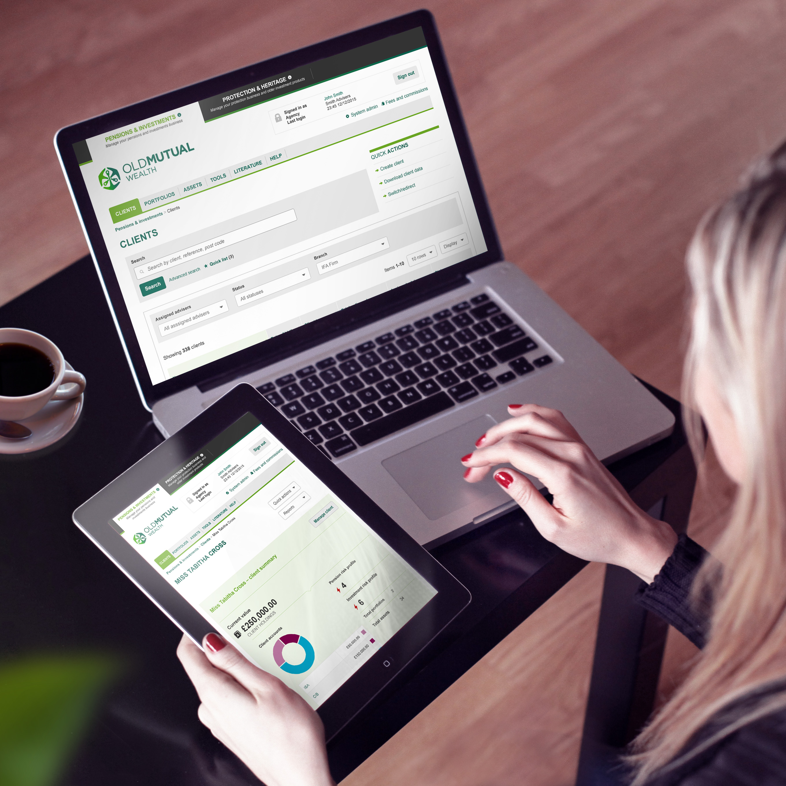
Before component libraries, design tokens and collaborative tools like Figma became the norm, many large digital products still needed the same things they need today: consistency, reusable patterns and clear documentation.
As Lead UI Designer on Old Mutual Wealth's new pensions and investments platform, I worked alongside UX designers, product owners and engineers to create a consistent interface across a large and highly complex enterprise product.
Although the tools were very different to those available today, many of the design principles I applied during this project continue to shape how I approach product design and design systems today.
My role
I led the UI design across a programme of work spanning more than a year, collaborating closely with a multidisciplinary team responsible for redesigning Old Mutual Wealth's adviser platform.
My responsibilities included:
- Leading the visual design across multiple workstreams
- Collaborating closely with UX designers as journeys evolved
- Defining reusable interface patterns
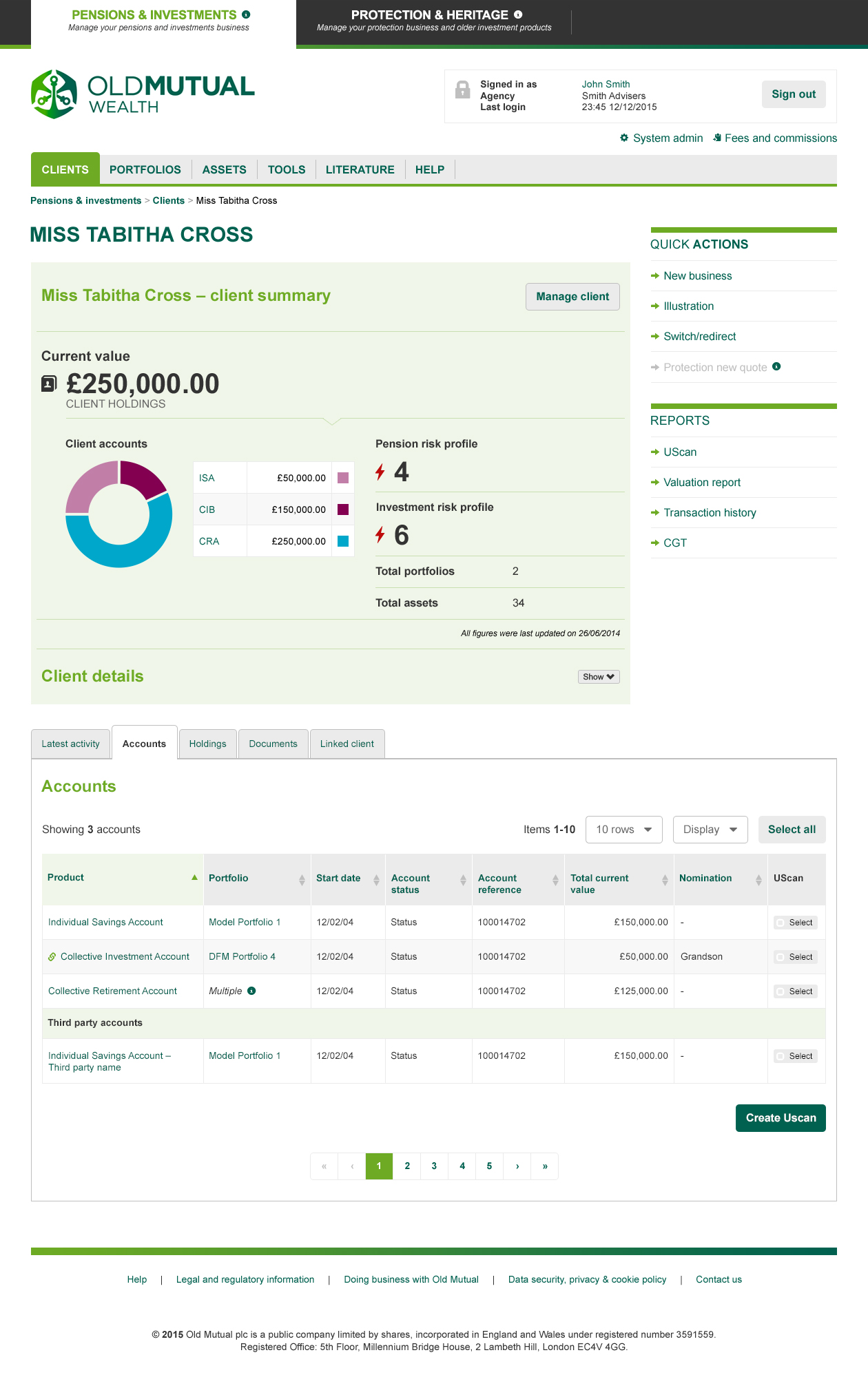
- Designing responsive layouts for desktop and tablet
- Producing comprehensive UI guidelines for development teams
- Maintaining consistency across the growing platform
The challenge
This wasn't a marketing website or a simple customer journey.
The platform supported financial advisers carrying out complex day-to-day tasks, including:
- portfolio creation
- investment research
- financial reporting
- user administration
- managing multiple client accounts
- batch processing
Each workstream introduced new interface challenges, while still needing to feel like part of a single coherent product.
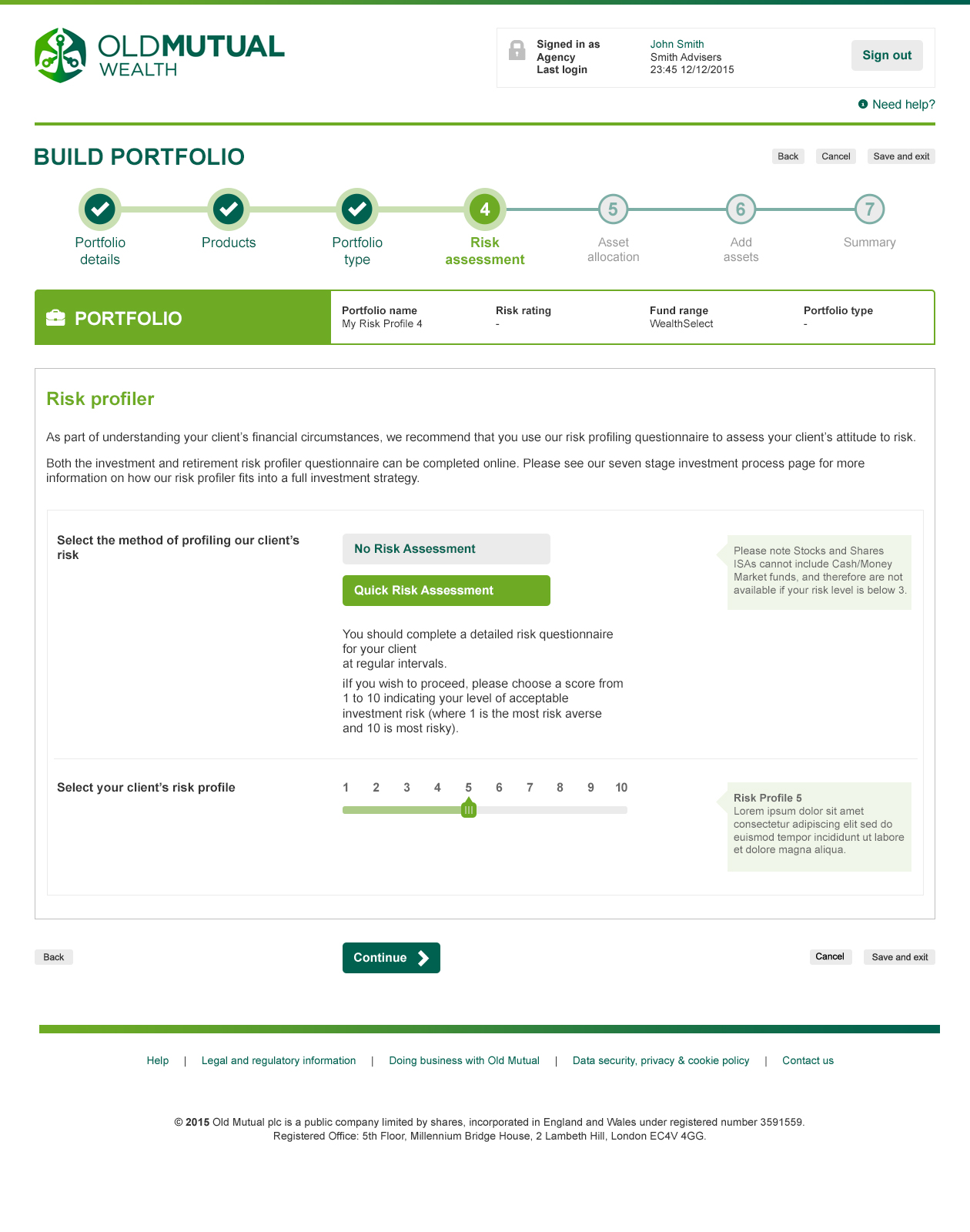
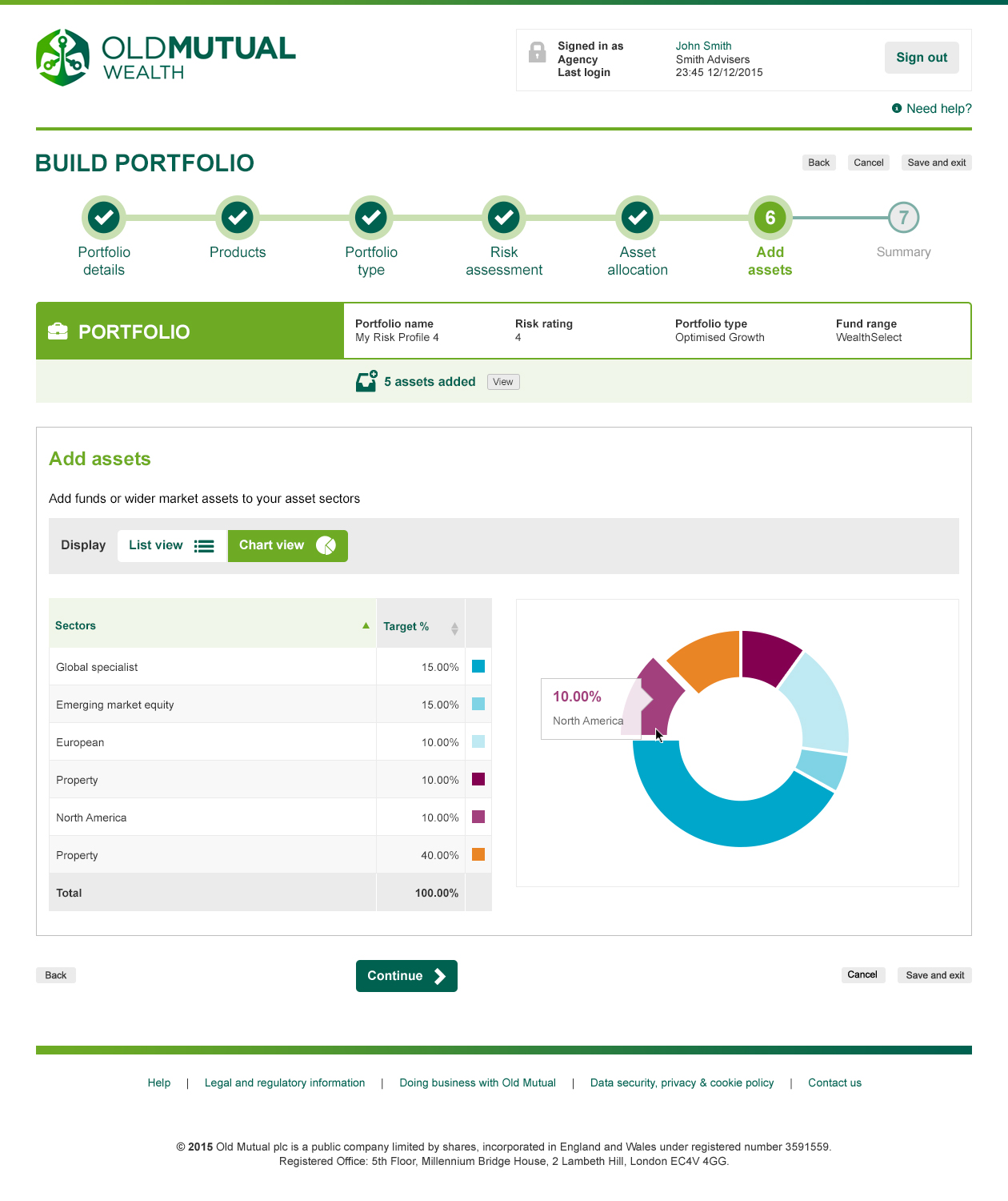
Designing for complex workflows
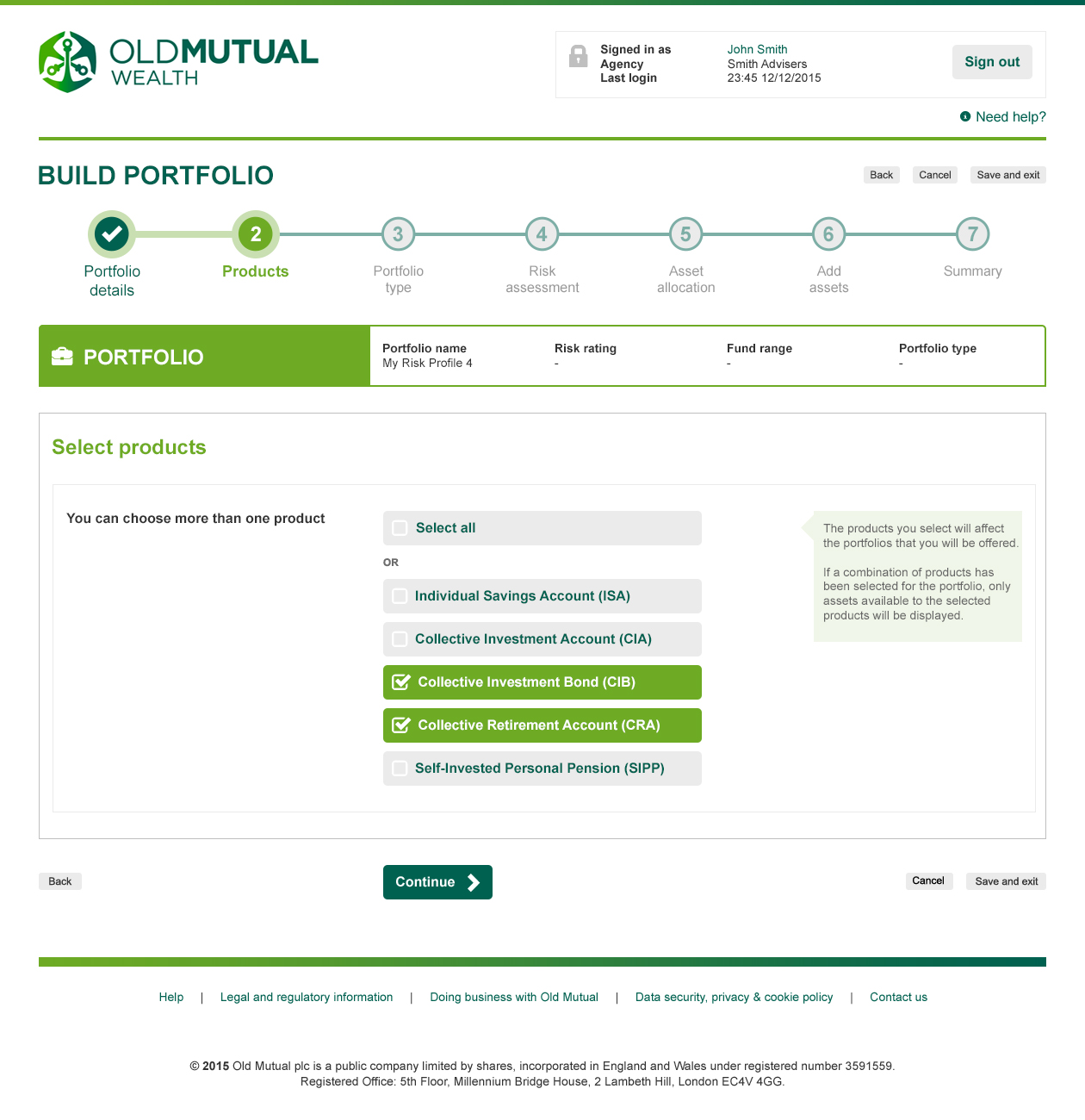
One of the biggest challenges was making complicated financial processes feel understandable.
Working closely with the UX team, I translated wireframes into detailed interface designs, refining layouts and interactions as new usability challenges emerged.
This wasn't a linear hand-off from UX to UI. It was a collaborative process where visual design often highlighted opportunities to simplify interactions, clarify hierarchy and improve user understanding before development began.
That continuous dialogue between UX and UI became one of the strengths of the project.
Creating reusable patterns
Although the term design system wasn't widely used at the time, we recognised the importance of consistency across such a large product.
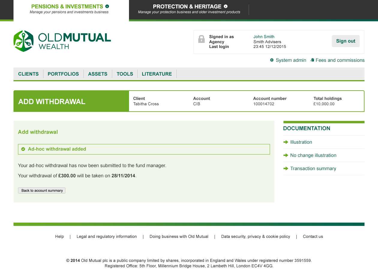
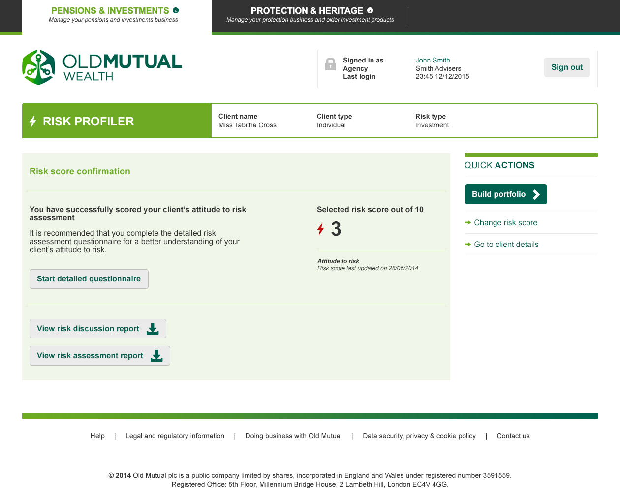
I created reusable interface patterns covering common interactions including:
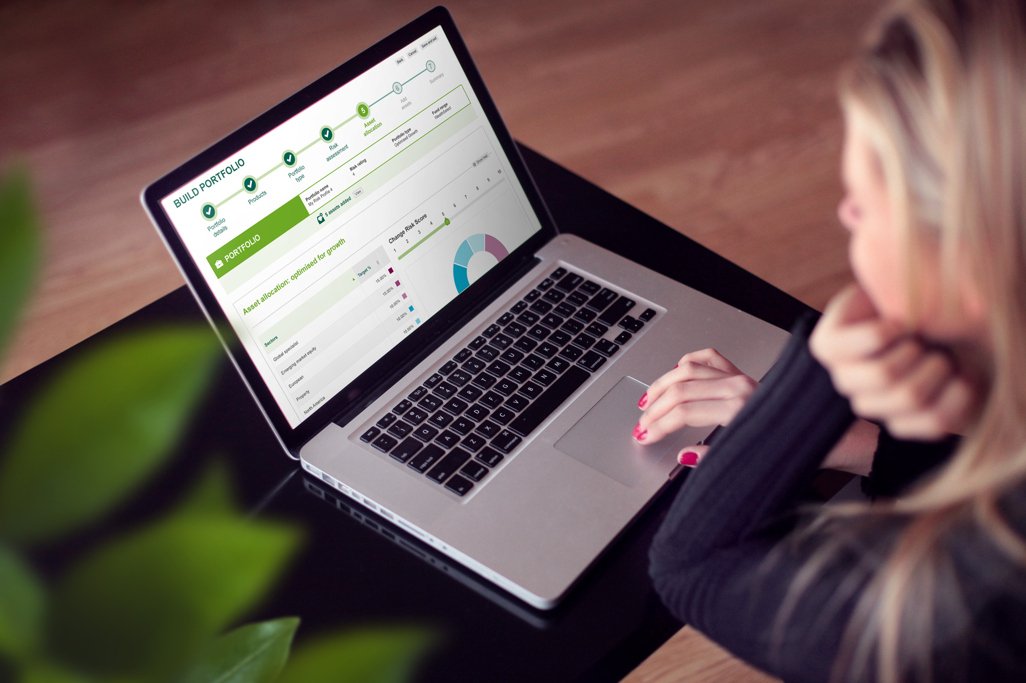
- progress indicators
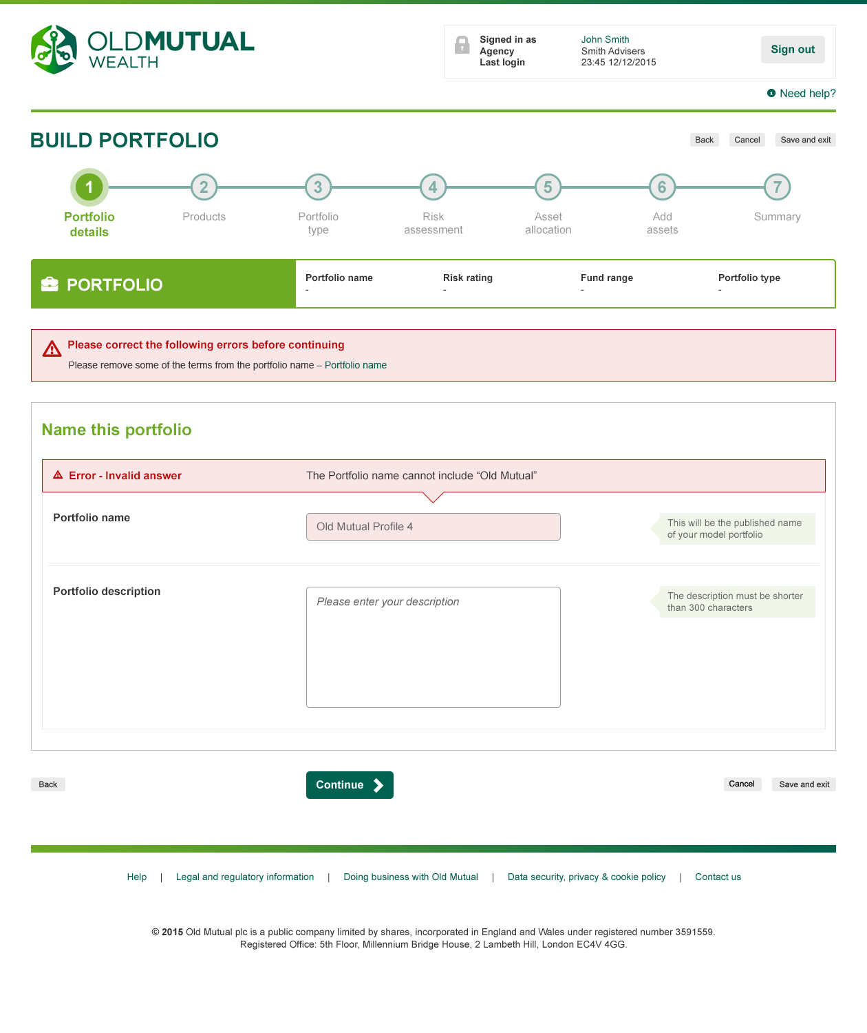
- validation and error messaging
- tables and data presentation
- navigation
- forms
- process journeys
- signposting
These patterns reduced duplication and helped ensure users encountered familiar behaviours throughout the platform.

Responsive before responsive was easy
The platform needed to support both desktop and tablet users.
Rather than simply scaling layouts, we carefully reviewed interactions to determine whether they should adapt for keyboard and mouse input or touch devices.
Some interactions required complete redesigns for touch, while others simply needed adjustments to sizing and spacing.
This ensured the platform remained intuitive regardless of device.
Building the design guidelines
As the project expanded across multiple workstreams, maintaining consistency became increasingly important.
Alongside the UI design work, I authored a comprehensive design guidelines document that eventually exceeded ninety pages.
The documentation covered:
- visual language
- interaction behaviour
- validation
- tables
- process flows
- navigation
- asset selection
- interface standards
It became the primary reference for both developers implementing the platform and future design teams extending it.
In hindsight, this was effectively an early design system—created before today's dedicated tooling existed.
Looking back
This project was completed several years before tools such as Sketch libraries, Figma components, variables and design tokens transformed how design systems are built.
Components were created using Photoshop Smart Objects, and the guidelines were produced in Adobe InDesign as a structured PDF.
The technology has evolved considerably since then, but the underlying principles have remained the same: designing reusable patterns, documenting behaviour, collaborating closely with engineering and creating consistent user experiences at scale.
Looking back, this project marked an important step in my own journey towards specialising in design systems—a direction that would later define much of my work at Three UK.
Tom Driver Creative 2026