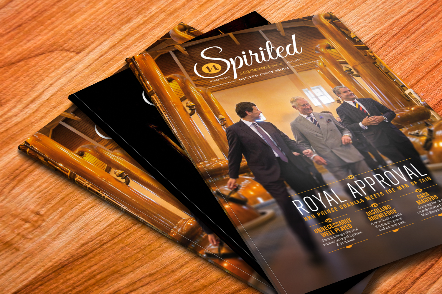
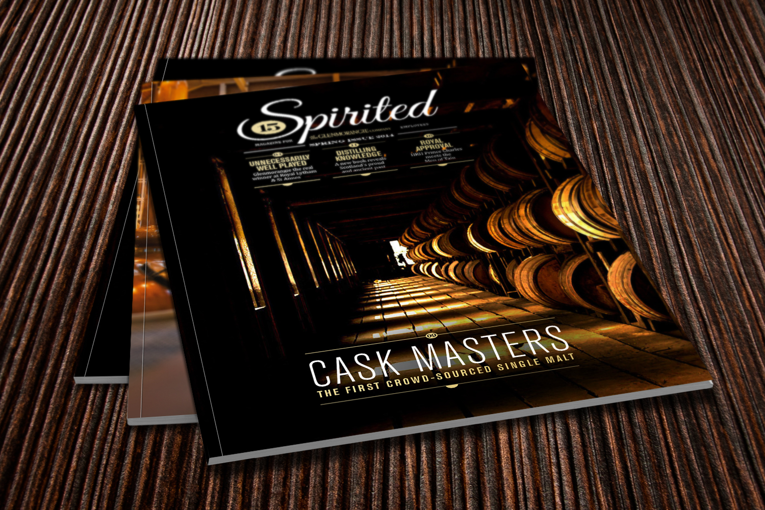
GLENMORANGIE
The brief was to look at the existing Glenmorangie magazine and see how we could push it into a level that reflected the luxury perception of this famous whisky brand.
We took time to research the 'look and feel' of whisky design, including a tasting trip to The Whisky Shop in London. This gave us plenty of moodboard input on the typographic style that the distilling industry use to evoke the 'world of whisky'.
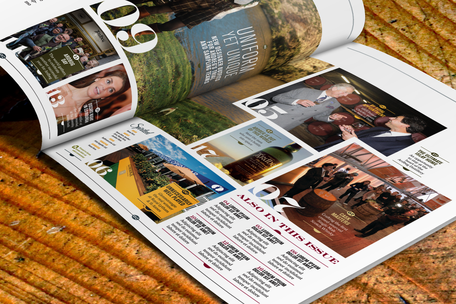
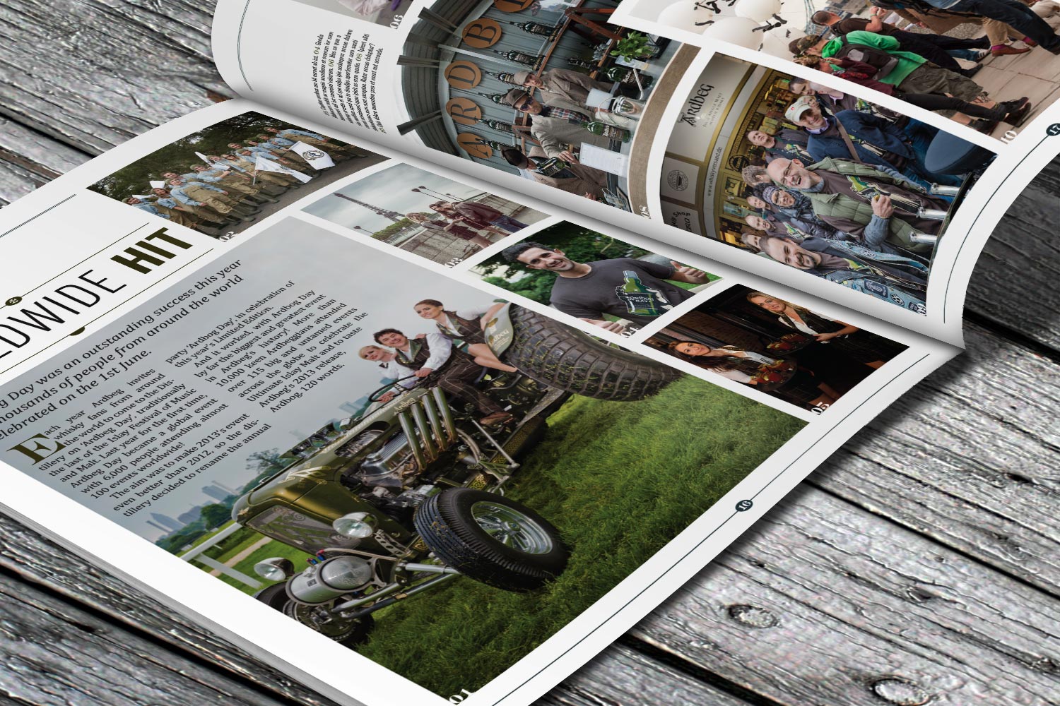
Our solution was to build a design around a carefully-curated set of typographic lockups (such as the masthead) using complimentary fonts that would create this whisky feel, along with reinforcing the level of luxury through perfect binding and proposed foil block finishing for the cover. The grid was also something we created to allow flexibility where you need it, but also rigidity in terms of holding everything together in a careful way. We felt the outcome was a mixture of contemporary and historical – akin with a lot of whisky branding nowadays.
We hit the mark: the first draft of the redesign was signed off straight away by the client, and the first issue in the new look was published in early 2014.


Tom Driver Creative 2017 — Greenford, London