Product redesign for Espresso
DISCOVERY EDUCATION

Discovery Education hired me through the summer/autumn of 2016 to join the Sprint team on a complete overhaul of the UX/UI of their primary schools education product, Espresso. As the lead creative, I was working closely with the lead UX designer, UX researcher, and the head of the development team as we progressed UX into UI, and eventually into development. As a joint UI/UX team, we had to come up with component-based solutions, test UX and UI variations, and get them approved from several different in-house stakeholder teams, before we could brief them into the developers.
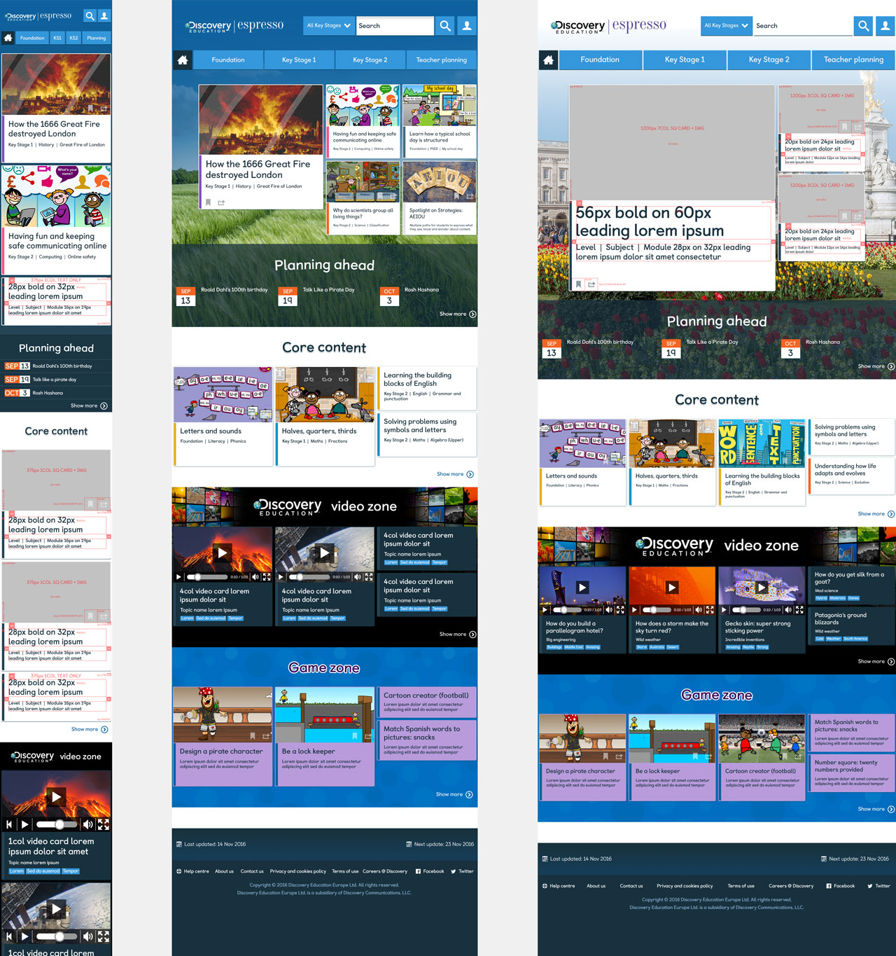
Responsive and versatile
The Espresso site needed to be very versatile: the landing pages at each stage required several template varations for teaser content. So we came up with a modular card-based system that would work seamlessly from mobile to tablet, desktop, and HD size (to accommodate classroom whiteboard projection).
Cards would be scheduled through the CMS to serve up specific content from the teaching curriculum, or event-style content for a certain time period.
Different card layouts were available to the site editors, and the ability to use a scene-setting background image/video. This was all in line with Discovery Education’s marketing: ‘Make Your World Bigger’.
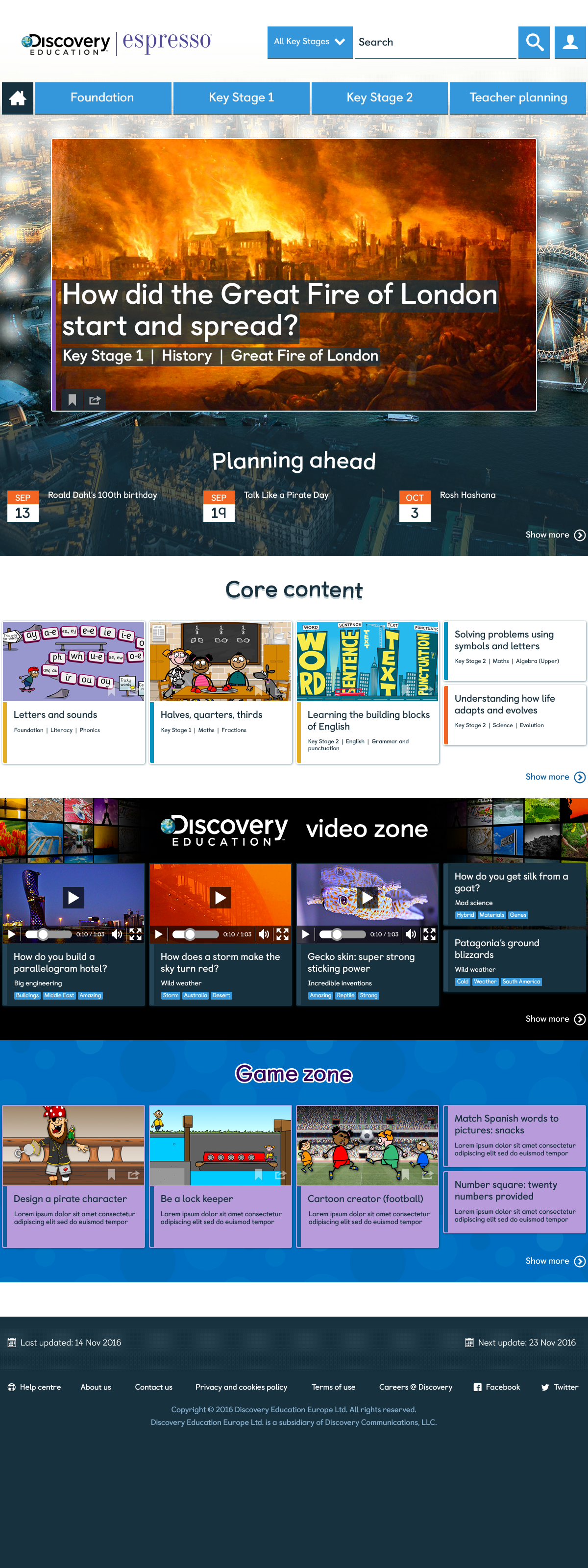

User-focused clarity
The UI was constantly tested to check clarity and legibility in the classroom setting using whiteboard projection. Helped by our user research, we came up with an innovative set of coloured shapes within a mega-menu dropdown, to help young children navigate the site while they’re still learning to read.


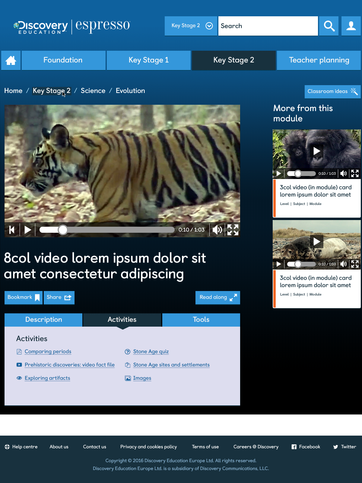
Presenting video content
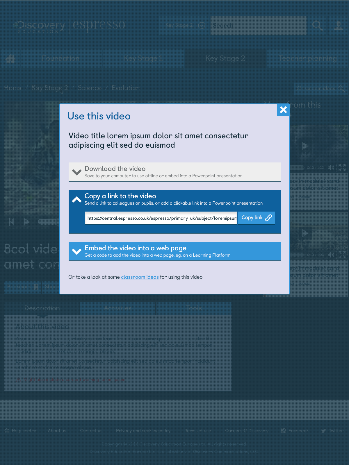
A large part of the new Espresso site was a channel full of bite-size educational video content, straight from the Discovery Education stable. We were tasked with creating a full video channel experience, using our card-based UI to interlink content by curated selection or by content theme. Videos would also appear within educational modules outside this area of the site, so the visual language of the UI cards, and how they interlink, was crucial to making this a seamless experience for the user.


Reporting the weekly news
Another important section of the site was the weekly news, which was curated to different age groups. Our UI card system was versatile enough that we could use scene-setting background imagery, and tease up landing page content in an appealing way.
All images © Discovery Education Europe Ltd
Tom Driver Creative 2017 — Greenford, London