
CAPITA SYNAPTIC
Capita Synaptic asked us to help create a complete UI toolkit for their pension planning tool portfolio. I worked as creative lead to develop design from the wireframes as they were created by the UX team working closely with me.
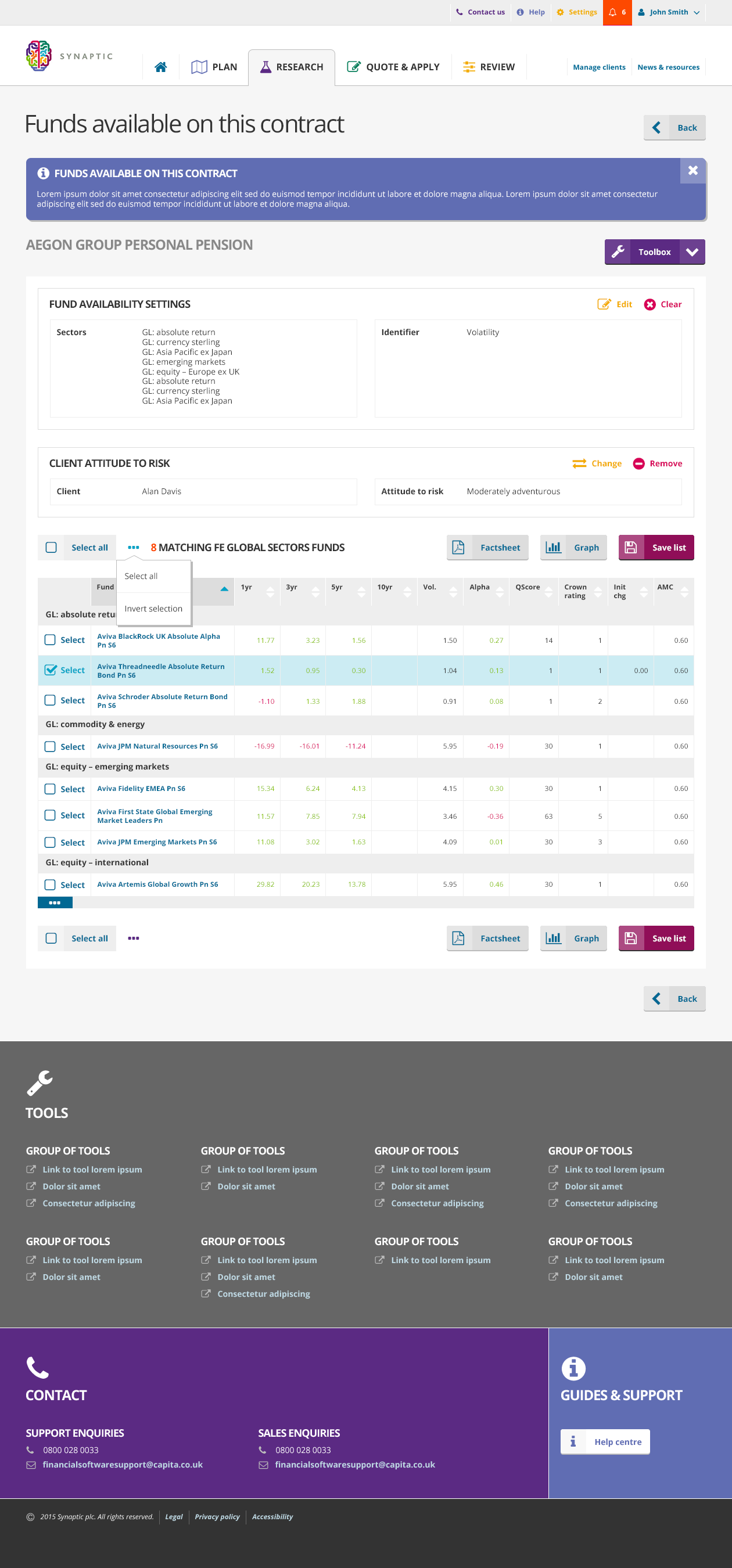
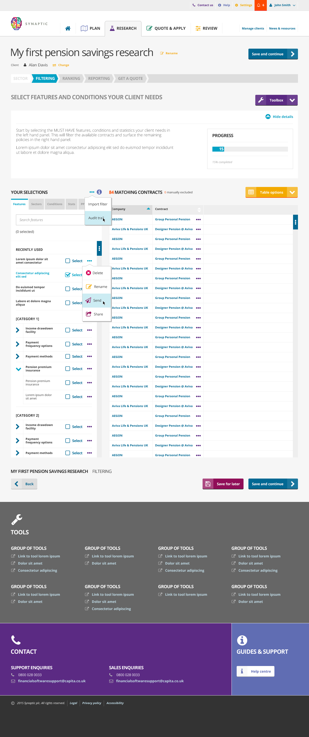
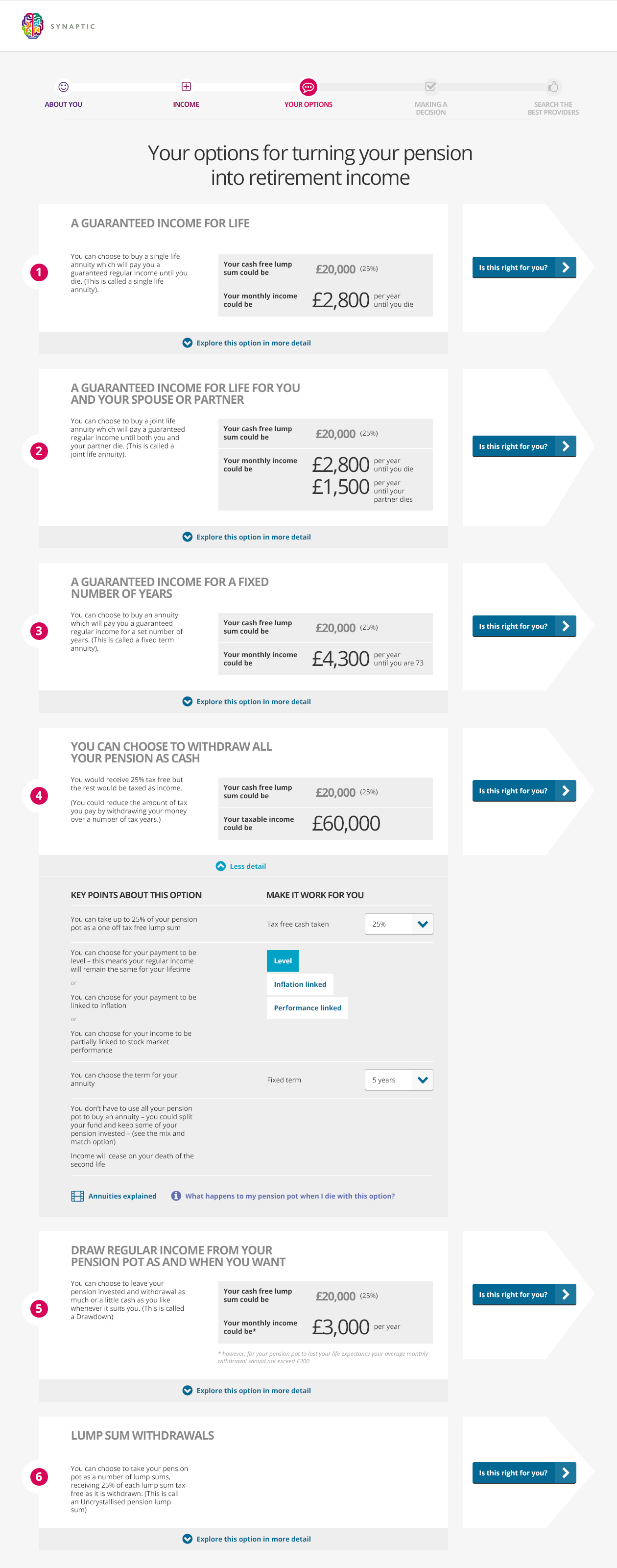
We were tasked with building a versatile responsive framework, including a wide breakpoint for HD monitors, for ease of use when displaying large tables of financial information.
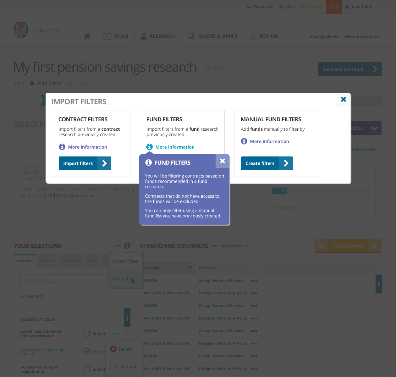
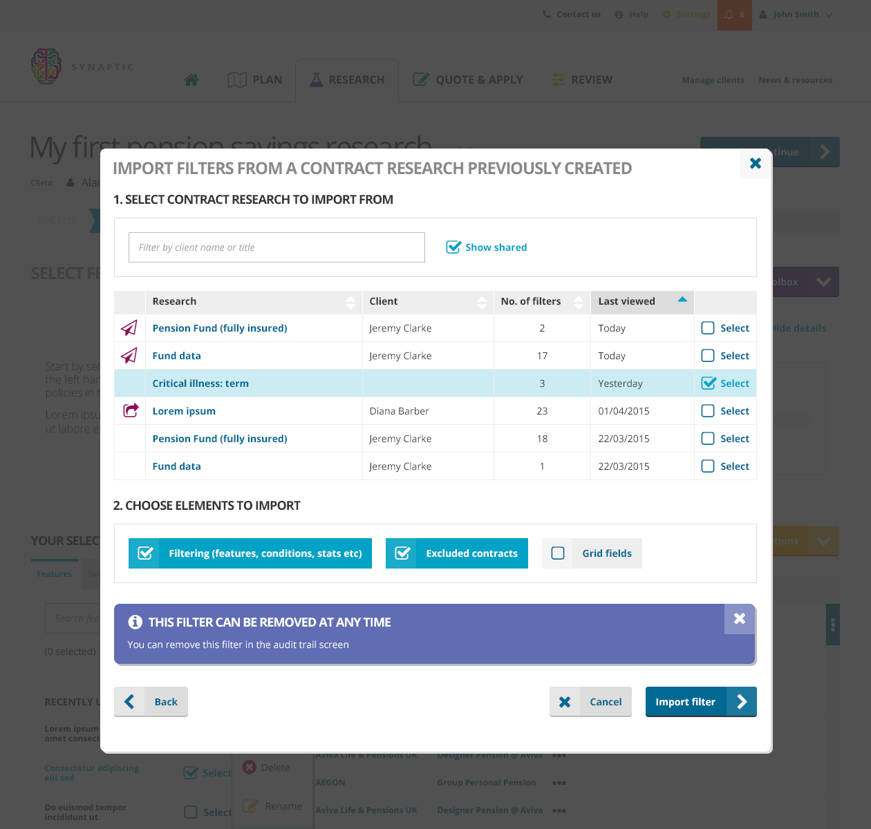
The UI visual language was required to work across several different pension tools, with a variety of processes and challenges.

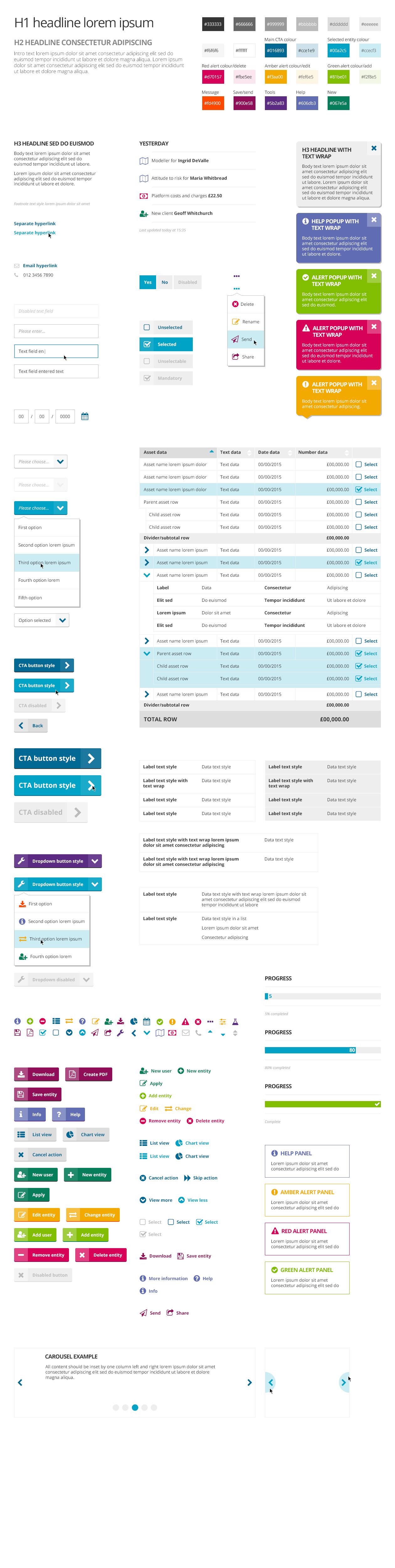
Creating a visual language
I built a set of visual rules to bring all interactions together, working across all these pension planning tools. We brought in some information graphic style to the colour palette, to ensure it was clear with messaging and validation which was urgent/completed/pending, using traffic light colours. Also the palette was strictly designed to organise the hierarchy of interactions from primary to secondary and tertiary, for uneditable/editable data, and selected/unselected states.
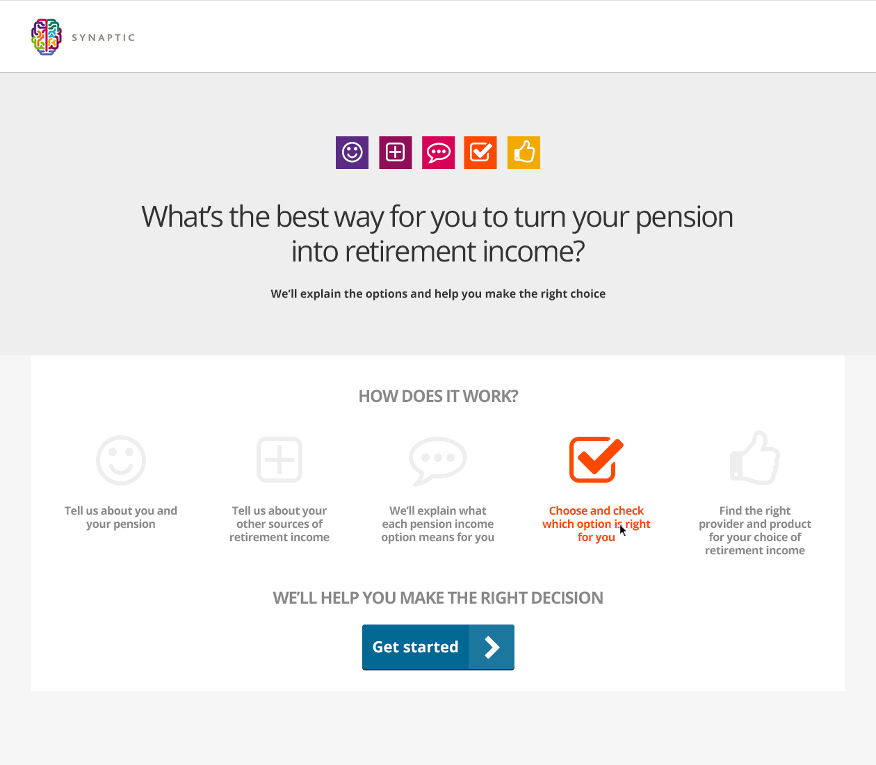
Clear and concise user journeys
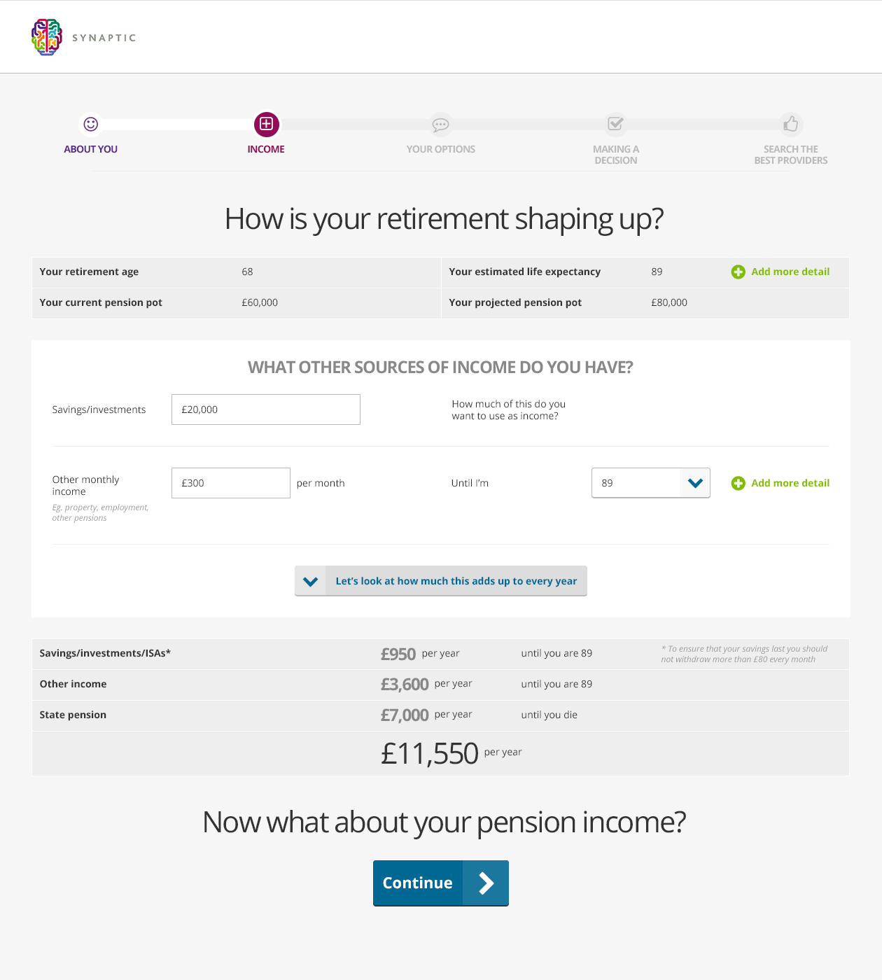
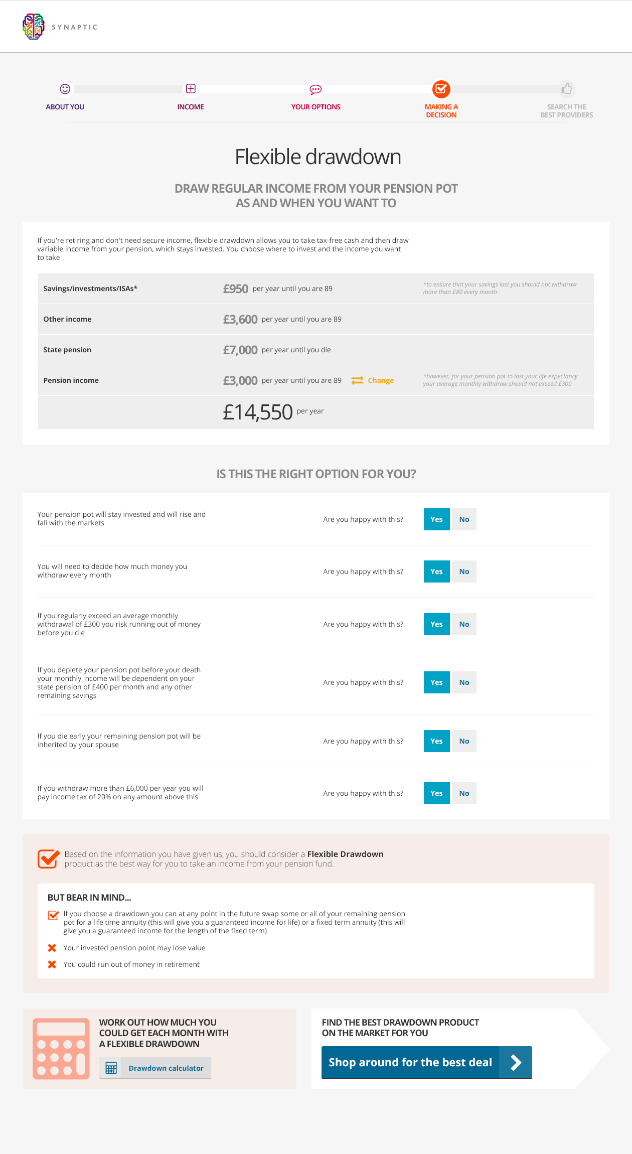
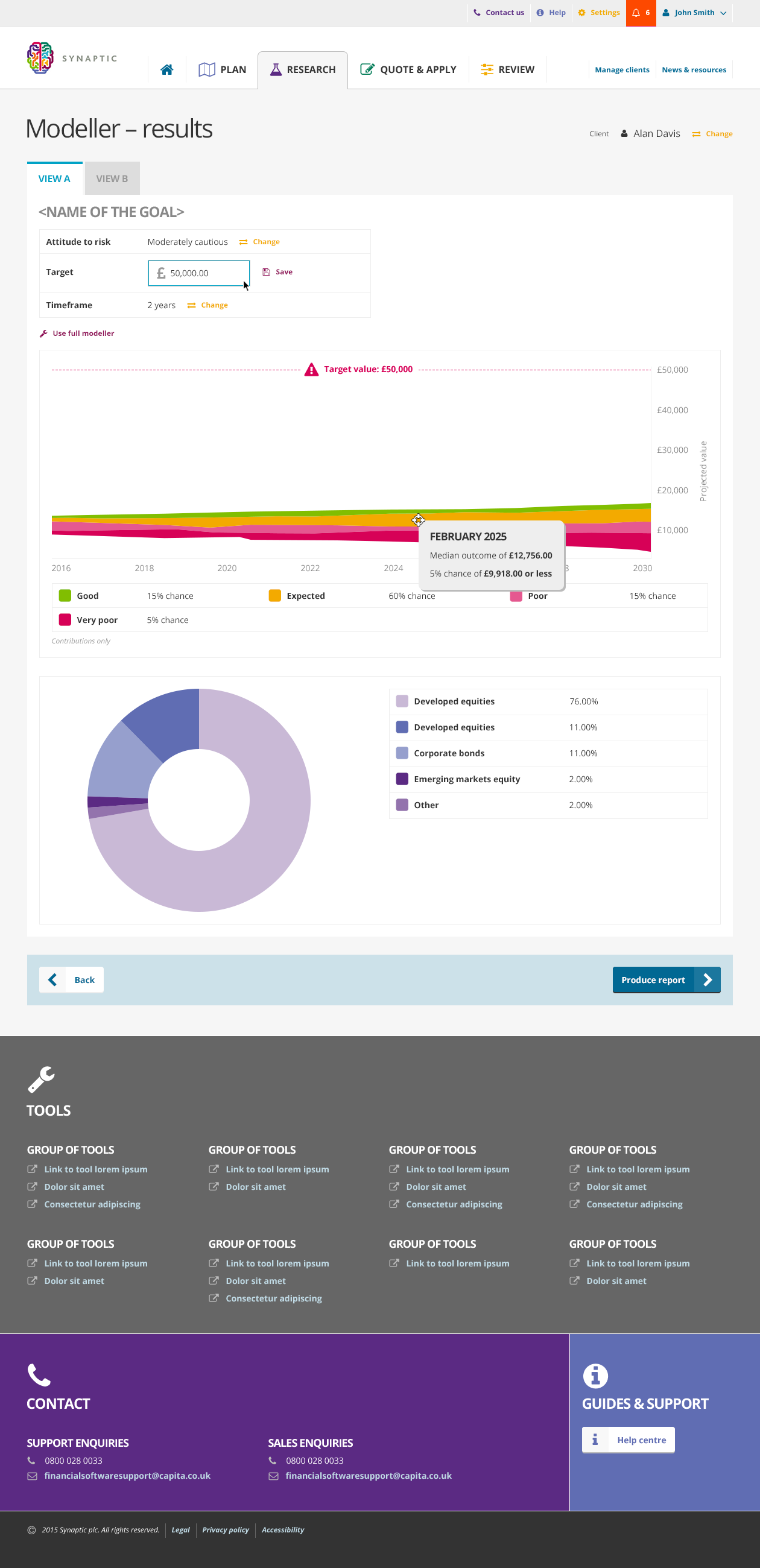
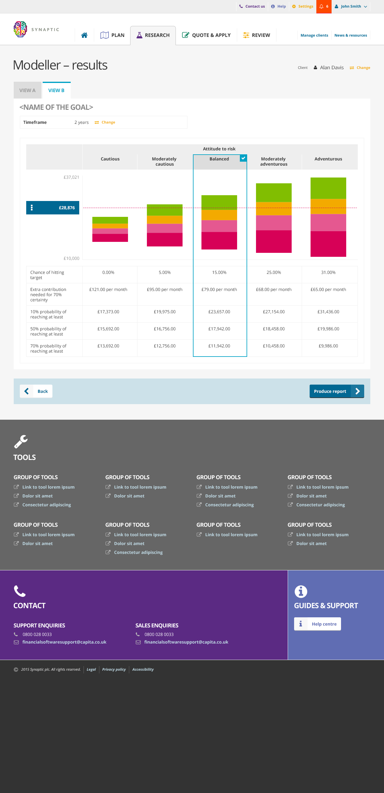
Visualising data
UI styleguide
Tom Driver Creative 2017 — Greenford, London